Paperback vs eBook

Every time I am offered the choice between buying a book in paperback or ebook form, I have a really hard time making the decision.  It’s a really interesting time in media/publishing right now.  When someone writes a book, it is published in about 5 or 6 different formats versus the traditional 1.  We are in between print and electronic media.  Print is almost dead, but not yet, and electronic media is definitely taking over the industry.  It’s hard to make the choice for a number of reasons…

Printed Books

Pros

  • The battery never dies on a paperback
  • It’s easier to read in bed, in the bathtub, or at the pool or beach without fear of getting water on your ipad
  • Paper books are more tangible.  If a book is sitting on your desk, bookshelf, or is in your hands, people can see it and it starts a whole conversation.  If you are reading your ipad or kindle, no one can tell what you are reading and if it’s just facebook or if you are reading Catcher in the Rye, which happens to be their favorite book of all time.
  • You can easily lend it to someone, which I love to do, even if I may not always get them back.  Lending books is a great way to share experiences with friends or family and have conversations.  Rather than saying, “well it’s a great book, you should download it” and then the chances of them remembering to do it are slim.
  • I love the smell of old books
  • Bookstores – one of my favorite things in life is to casually peruse a bookstore.  I love   reading and just being able to walk around and read the titles and book jackets of books to chose the ones I want to read and find out about new books is a fun way to spend an afternoon.  (I could spend upwards of 3 hours in a barnes & noble – and have done it on numerous occasions).  There is also another conversation that will be missed if you buy all your books in an online store – chatting with a store clerk.   Used bookstores also fall into this category and will be completely extinct because of ebooks.
  • Being able to write/highlight/flag passages or pages in a book.  I am constantly underlining, writing in the margins, highlighting, and flagging pages of books.  I don’t just read them, I study them.  Sure some ereaders have these features, but it’s just not the same.
  • Easier on the eyes
  • I’ve always wanted a library in my home similar to the one in Beauty and the Beast with the floor to ceiling ladder on wheels.
  • When you are on a plane and they tell everyone to shut off their electronic devices, you can keep reading. haha, naner naner boo boo.

Cons

  • Having a ton of paper books is heavy, takes up space, and is annoying to have to move
  • They could get ripped, wet, burned, or in some other way destroyed
  • Easier to lose
  • More expensive
  • You need a lamp or light to be able to read it

eBooks

Pros

  • Cheaper
  • Convenient – if you buy a book on iBooks on your iPad, it’s automagically on your iPhone as well so you can read it on either device whenever and wherever you go.
  • Lighter – actually doesn’t weight anything more than the weight of the device(s) that I already carry around everywhere I go.
  • Has it’s own back light so you don’t need a lamp or reading light.
  • Novelty/app features – It’s cool to be able to read a book electronically and swipe through pages, change the font size, background color, etc.

Cons

  • Basically that you can’t do any of the pros of printed books
  • If you don’t already have an eReader or iPad, you have to buy a device to read it on

I have both printed books and ebooks and love them both for different reasons, but for some reason I am more drawn to printed books because they just offer a more personalized experience that allows for all kinds of conversations to start.  Someday, my grandkids are going to think I’m so cool for having real books.  Books will be the new records.  People will collect them and hipster kids will think they’re cool for having a vintage or throwback paperback book.  They’ll always be my preferred format for reading.

Which format do you prefer?

Notes from TBTF’s User Experience Design Event

These are the notes I took tonight at the Tampa Bay Technology Forum’s User Experience Design event at the Tampa Museum of Art. It was a 2 hour event with networking, a homepage throwdown (critiquing 2 websites from audience members), and a panel discussion & Q&A. It was a fantastic event. Two years ago, a lot of it would’ve gone over my head, but I found myself knowing all of the acronyms, buzzwords, and what the panelists were talking about, which felt great. Everything they talked about was a topic or subject that I experience on a daily basis in my job. I left feeling excited and inspired to learn more and create beautiful and well thought out user experiences.

Always a studious note taker, I couldn’t resist this opportunity to capture the pearls of wisdom, so enjoy!

HOMEPAGE THROWDOWN – critique websites

1. wrecking ball media group

– When you first come to a site, have a call to action, a priority, a path in, a more directed way into what you do.
– Having words in different colors signify a link – a call to action
– If i’m your perfect customer, how do i know right away? if not, how do i know im not and i should move on? How do i know that it’s great to me? WHat’s the product?
– When you rely on type, its hard for 1 thing to be compelling for everyone.
– Highlight a few areas
– Your pitch should be right there.
– What’s the angle you can communicate to a specific need or set of people.
– The art of the start – book – the opposite test – used for value propositions – If no one would ever say the opposite of that, then what you’re saying is opposite. “Clearing the way for digital awesomeness” is the tagline – so no one would say “clearing the way for digital terribleness”
– Rotating images – do AV testing – let the user tell you what resonates with them
– footer slider – wrecking ball at a glance – they like it. think its cool. but its not obvious to click on it. The title signifies portfolio.
– The strong call to action calls people through a funnel.
– responsive – yes but all the tiles and content go away

2. Cybonix Solutions

IT troubleshooting company – home users and mom and pop businesses

– They like that you can quickly and easily see what they do. Remote support. anytime, anyhere. Good visual hierarchy to the type.
– POV – rotating panels – good – but rotates too fast
– Says the right thing but said too much – all of the taglines are awesome
– be more explicit and emotional with the call to actions “go ahead try us, read about the availability”
– brand identity – whats going on with the rotation is a separate look and feel of the logo – they dont go well together. to create a perception of stability and consistency you want them to be the same identity across the entire site
– Fix padding between logo and navigation
– You’re done well at selling what you’re doing but what about return customers?
– Also missing one core identity statement – we are the ____
– Focus on as specific a set of people with as specific of a set of problems as possible – you’re different for that reason, tell that story. A narrative and story is missing. Its a little generic in spots. Differentiate yourself between other people on google.
– Huge missed opportunities with video. Incorporating video into your site can tell your story and narrative. They find great success with using videos with their site. And those can be used elsewhere.
– 1 page sites are trending in that direction of having everything on the homepage whereas having the story on about page. THe homepage is the new about page and the about page is the im bored and why should i trust you page.
– Check the time on page on analytics, its mere seconds so your value propositions have to be right there in the first few seconds.
– There is a sense of urgency and frustration to the customer needing troubleshooting. Conveying the sense of urgency would be good. Live chat or number to satisfy the sense of urgency.
– WYLTIWLT – Would you like to I would like to – would you like to (button name) “learn more” I would like to “Learn more”

Next friday night at tampa bay way – sykes – free – another full website critique

PANEL DISCUSSIONS

PANELISTS –
Jody Haneke – founder of Haneke design – develop solutions for desktop, mobile, and tablet devices – went to ringling and did graphic design and user experience design – working on kiosk projects – doing mobile projects before mobile was mobile. A remote mobile user.

Ken Whaler – Gyroscope Studios – art school, then web design and development then business school – work with branding all the way to interaction and design. 7 year old company. Independant.

Sean Walworth – Triad Retail Media – online advertising agency – monetize ecommerce websites

Tyler Goelz – Redwood agile – front end developer – works with startups and entrepreneurs

Justin Davis – Madera Labs – User experience design company

—-
UX AT A HIGH LEVEL

– It encompasses 2 things: 1 – the usability of anything (how easy it is to use, navigation, layout) 2- aesthetic (bringing in brand identity, visuals, look and feel).
– Boils down to the success of your product – if people dont want to use it and dont enjoy their experience with it, it’s likely to not succeed. Now there is a lot more competition, so it becomes essential to maintain your competitiveness in the field with experience.
– Goes across so many levels. Copy, editing, right choice of words to convey a call to action. The job interview begins in the parking lot. The same when you demo a product. When you pitch an idea, they need to feel good through the whole process. Knowing the concept of keeping your customer informed of what’s going to happen next and what they should expect.
– The feeling of something pleasant. Pleasant could be something different for everyone in this room. Uses the Jawbone UP website, app, device, packaging, etc. The whole process was pleasant. It goes all the way from landing page to customer service, etc. UX is the whole company, it goes beyond the website and web. If its not a good UX across the board, the user wont enjoy themselves. It’s a holistic approach to UX.
– How do you start creating good UX? You start before you build the product. Do customer analysis and vet it out. FInd out who’s going to buy it and why. Find 10 people to answer your questions. If they dont give you the answers you want, change the questions or change the product. The day of launch put a survey up on the site, how do you like the site.
– Define the user, who are they, what do they care about? Find out everything you can about the demographic. Define your target audience/users. Forrester research. Before you design. Picture the person and try and meet them in the middle. Build an empathy.
– Know your audience. It’s huge. Example of time saving keystrokes in visual studio that they later added to outlook.
– Create a persona of who’s going to use your product. Google ad words. Set up an email group and see what the feedback is. Ask them the questions and refine from there.
– Whiney Hess – great UX designer. If you don’t talk to your users you’re not a UX designer. You’re just a designer at that point.
– Tactics to do research to get in the head of the users to know how to design it for them:
– Do spy research – view people in their natural habitats.
– AB testing – place buttons in different spots, move images, etc. Keep it going.
– Especially in a mobile world – quickly get it in the mobile context and try it out instead of just on your desktop monitor.
– Dont let perfection keep you from giving up.
– Get prototypes out there – App cooker, axure, etc
– Usability testing and user testing is a big part of the design process. Every time you test, you stand there in bewilderment not understanding why a user doesn’t see a button or use the app the way you designed it.
– You can discover that users are using the product in a different way that wasn’t even intended.
– Conventions – you can take your design to a new area but there are certain traditional conventions that we come to expect. Logo always upper left, main nav across the top. Keep the obvious things.
– A website is a canvas for content. Get creative with the content instead of the navigation.
– So What. You have a straight forward web app and a robust mobile app. so what? what benefit is that? Is that appropriate?
– Defensible design – You have to be able to defend that decision.
– UX is often brought in at the middle or end of a project. How to get the UX process back out in front where it belongs? It has to be a company decision. It cant be one person who comes in and makes a decision. It’s a culture thing. Being able to iterate through the problem. THe more you test the more you refine and come out with a better product that people want to use and that’s a better UX.
– FInd out what the problem is. THe client will say “We need this” okay, well tell me what the problem is. Because the solution they think is right might not be right.
– Use conversation starter questions. What’s wrong with the old one? WHat do you want the product to do? What do you want to avoid? If it could just do 3 things what would they be? To find out what’s most important.
– Constantly remind them that the target user might not be them. Sometimes they forget that or don’t realize it.
– AB testing – show 2 things – which is better, a or b? Or even ABC, if there are 3 versions.
– Look at trends.
– Sit down and watch the user use the product and have them talk to you about it. Do it with 5 people, by the 5th person, you’ll be able to predict what they’ll say.
– 80/20 – 80% of your clients are going to make 20% of your profit. Who actually counts as a user.

THE PROCESS OF DESIGNING

– They start with pencil paper and whiteboard – to get ideas out – to exhaust all things that immediately come to mind to hone in on what it is you want to do. You have much less invested on white boards than you do in a complex illustrator wireframe.
– Competitive analysis – meet with client and find out what makes them competitive and find out the root of the issue and what they’re trying to solve. Then start sketching and wireframing. Talking to client to see if the strategy is the right fit. Do an interactive prototype.
– Go from rough sketches to wireframes to interactive prototype. Or skip the wireframes
– Scope – pen to paper, mockup/prototype, design, test, launch. axure foundation. style guide. MVP development.
– Interactive wireframe via webex. Sketching happens internally only. Story is big. What kind of story are we trying to tell? Let the story drive the content.

METHODOLOGY

– Which is better for ux, agile or waterfall?
– Agile is great but sometimes it flies in the face of design. They adopt agile in the prototyping/design phase. Go through as many iterations in the design, then move into build phase and more waterfall process.
– Another panelist uses as Lean and agile and bootstrap as possible for clients. No waterfall. It could work for the client but not for them. Use whatever works best. Don’t settle for one. Use what’s best for your clients.

MOBILE
– Made our lives harder – going to Multi cross channel touch applications
– How is doing mobile UX work different than web UX work? The diff btw mobile apps and web content. The web is distributing content in a wide range of devices. But apps are a different story. Written natively and takes advantage of the device characteristics and it’s a tool used to solve problems in life. The first decision is – is this delivering content or are you truly creating an app? There are 2 different processes to go down those roads.
– You’re still telling the same story just quicker.
– What’s making them come back to that app to use it?
– Being hyper aware of efficiency in a mobile setting. Efficiency of the system and whats on the screen.
– SOme people as mobile as an extension of the web but you have to think of the utility of it.

– What role does context of the user play into what goes into mobile and what doesn’t? How do you use context in that discussion? Comes down to the core principal of the application, what is it for?
– A lot of things we design now are platform oriented – working off the same platform. How facebook looks on the web, mobile device, versus how it looks on flipboard. You cant take pictures etc from within flipboard. It’s optimized for each of those contexts.
– Can you use your website with one thumb? because a lot of time you are holding coffee. Can you find what you’re looking for quickly?
– Store locator, for example. You want it prevalent on the mobile. Not as prevalent on the website.
– How important is the phone number in mobile? So you can tap and dial it. Think through the context.

– What are the things people should look for when hiring a UX designer?
– SOmeone who gets annoyed by everything. Someone who is hyper sensitive, hyper vigilant. Someone who cares about nuances and details and has the eye for it. SOme people will never see that 2 things are lined up.
– Do they like what they do? bc they’ll put more into it than someone else.
– Being a consultant who can guide the client on what’s best
– Personal brand and personal style
– Being a good presenter, salesperson, backing up your work by best practices and research, getting someone to align with your direction. Convince them it was their idea.
– Picking up on things that the client might not think about. Full circle. Example, the copy in the follow up email for a signup. Think it through. Keep the conversation going. How can you use it as a value prop. Sell them something else in the email. What’s the campaign to send to that email group now?
– Wistia – they do video hosting –
– UX needs to be a part of the corporate culture.

– Put users at the front of the conversation and design for them.
– Listen, you’ll find gems of wisdom from the client and users. Be open and willing to listen and change.
– Be kind. Treat your users how you’d want to be treated.
– ASk why 5 times. If you ask once, it might not be the right answer. By the 5th time, they’ll know what their answer is. Keep validating your idea, designs, and products.

USF St Pete – Certificate program – for iOS development – 12 week course – Jesse Currey leads it
Hannekydesign.com

Course called USer Experience University – 10 week intense course – 3 weeks – only 10 students – led by Madera Labs.


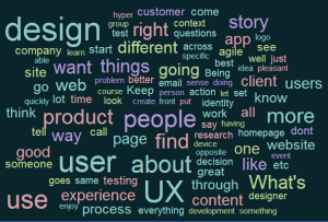
Here’s a word cloud I made from the notes above.  The words with a larger font are the most frequently used and probably the most significant.

word cloud


My Favorite Tools

People are always asking me “what tools do you use”? I’ve filled out multiple surveys on the subject, such as the 2012 Writers UA Tools Survey. So here is a list I put together of the hardware, software, and apps that a Tech Writer / Business Analyst / User Experience Architect cannot live without.

In such a modern and digital age, it’s weird to think of how tool-dependent we are. People have always used tools in their daily lives and always will. It’s just part of life. But it seems like the tools you use can define you. For example, “are you a mac or a PC”? Answer carefully because you could be judged based on your answer. The tools we use are important, but what’s more important is what we do with them; what we create and contribute to the world with them.

So here are the tools I use on a daily basis. Usually when I have the choice of tools, I choose the one that produces the best output, while being easy to use, and affordable.

For anyone who is trying to break into the industry, I would recommend downloading free trials or purchasing these tools and becoming familiar with them. It can help immensely to have a leg up before you sit down and try to use a new tool for the first time and produce real work on it immediately.

Software

  • Word processing: MS Word – obviously… you can’t live without this tool 🙂 By now, I can make Word sing and dance.
  • Spreadsheets: Excel (aside from the usual spreadsheets, I use this a lot for project management to make timelines and schedules – I know I should probably use MS Project, but it’s a pain in the butt, so I use this instead)
  • Presentations: Power Point (the old staple), Prezi (the new flashy kid), and Keynote (for apple products – I use this one to do presentations on my iPad)
  • Quick Reference Guides: Adobe InDesign (somewhat of a high learning curve, but produces really beautiful documents) or MS Word (less beautiful documents, but easier to use – I usually start in word and then make it pretty in InDesign)
  • Help Authoring Tools (HATs): Madcap Flare, RoboHelp, Framemaker, DocToHelp – I like DocToHelp the best because it integrates with MS Word and is very easy to learn and use. Flare is becoming the new industry standard and RoboHelp is the old industry standard so you still see that on a lot of job descriptions.
  • Tutorial Videos: Camtasia Studio, Adobe Captivate (I prefer Camtasia, it has less of a learning curve, easier to use)
  • Photo Editing: Photoshop
  • Screenshots: Snagit – this tool is AMAZING and its really cheap. It allows you to take screenshots of any portion of your screen, then you can edit those images. You can also create videos with it. It has a lot of useful functionality and will become a tech writer’s bread and butter. Used daily. It’s very easy to learn and use.
  • Illustrations: Adobe Illustrator
  • Blogging: WordPress
  • Wikis: Mediawiki, Confluence
  • Audio Editing: Audacity
  • File compression: WinRar, 7-zip
  • FTP: Filezilla, WinFTP
  • Internet Browsing: Chrome
  • CSS Editing: Firefox web developer extension and Firebug
  • Web design and HTML Editor: Dreamweaver (not free) and Notepad++ (free)
  • Flowcharts: Visio – creating flowcharts, process flows, organizational charts, swimlanes, and diagrams.
  • Requirements Management: I use Case Complete to write, manage, and produce reports on software (or product) requirements specifications, use cases, test cases, dictionary/glossary, actors, and more. It’s fabulous. This particular tool can be somewhat expensive if more than 1 license is needed, but it does it all and I use it every day.
  • Wireframing: I use Balsamiq for creating wireframes (also known as mockups / prototypes) of User Interfaces for web and mobile applications. This is by far my favorite tool. It’s very inexpensive, fun, easy, and fabulous. It creates beautiful wireframes that really translate information architecture and concepts of the application to the clients. It helps them visualize things really well and is easy to manipulate and change as they provide feedback. (Another top industry tool is Azure. I haven’t used it but I’ve heard it is clunky and requires it’s own Azure administrator to run it.)
  • SEO: Google Analytics – Google pretty much owns the internet now, so the only way to do SEO is the way they want you to.
  • Music: Spotify – this free tool is IMO the best online streaming source of music. You can create playlists, use a radio feature, send songs to friends, etc. I have it installed on my PC, mobile phone, and tablet. I listen to music all day, so it’s a must.
  • Notes: Evernote (free) – this tool syncs on your PC and tablet so you can take notes wherever you go and it’s there when you need it. I use it all the time.

Hardware

  • Monitors: 2 monitors is the ONLY way to work. It’s a must for me in any workstation.
  • iPhone and Android mobile phone – I have both because I design mobile applications and I use both platforms to see how the app would work on both, to get ideas, learn new things, and better understand usability.  (But I use the iPhone 5 as my phone and I MUCH prefer it to android. I keep my old Samsung Galaxy SII around for testing.)
  • iPad and Android tablet – same reasons as above. I love my iPad and I’m on it constantly.
  • Bose noise cancelling headphones – another must. When I’m in the zone, I put these babies on and the noisy office around me fades away so I can concentrate.

Apps

These are some of my favorite apps on my phone and tablet:

  • Productivity: Evernote, Flight Tracker, Prezi, Keynote
  • News & Entertainment: Flipboard (this app takes all the articles, videos, tweets, pics, and posts on your interests from all over the internet and brings them all to once place for you – It’s magical), Buzzfeed (I feel like this site was created specifically for me because every day I read a post that is hilarious and so relatable)
  • Social: Facebook, Twitter, Tumblr, Pinterest, Instagram, Linkedin
  • Music: Shazam (recognizes music playing around it and tells you what song and artist is it), Spotify
  • Blogging: WordPress
  • Food: Yelp (food reviews, tips, pics, and info – I almost never pick a restaurant without this app), Starbucks (I love this app because you can pay with your phone and earn points for free things)

I love using new tools so if you have any suggestions for me, please let me know.

Dusting Off My Running Shoes

Image

Dusting Off My Running Shoes

MB2x is participating in the Tampa Bay Corporate 5K race in downtown Tampa on April 11th and we are all so excited to race together! We have been training 2x a week with our corporate wellness trainer and have all been on a custom nutrition and supplement plan to get healthy and gear up for the race.

I haven’t run a 5K since the Iron Girl in April of 2010 when I did the Couch-to-5K program. I’m a little rusty, but excited to get back out there.

Please LIKE our race shirts (designed by our amazingly talented graphic artist Theresa Steele) so we can WIN the Best Tshirt Design Contest. The shirt with the most likes wins! https://www.facebook.com/photo.php?fbid=428318603928345&set=a.428318100595062.1073741827.373382532755286&type=1&theater

New Domain Name – Getting legit, little by little

I recently bought a real live domain name for my humble little blog and I’m ashamed to say that it took me a little while to figure out how to host it on wordpress and use the godaddy domain name, but I figured it out and we’re up and running now!  I did everything right except changing the nameservers to the wordpress nameservers, but once I did that, it worked. I think it was more a result of how incredibly busy I am than a lack of know-how.  But lesson learned.

So welcome to my new domain, WriteEditRepeatPublish.com!

I also added a new contact page so now you can send me messages!  

New Website Launch – Responsive Design

We just launched our new company website yesterday and I couldn’t be prouder of it!  It was a collaborative process between our graphic artists, developers, myself (as copywriter), and a project manager.  It was a really fun project.  Our team worked extremely well together on it and we all learned a lot in the process.  

My favorite things about the site are the design, the responsive design, and of course, my own copy.  🙂  The copy was really easy and fun to write because I had total freedom and could be a little playful and creative with it since it’s for our own website, we are the client!  

The design is really sleek, modern, and beautiful.  I love the colors, layout, and typography especially.  It has such a fresh and techy-yet-creative vibe that is visually enticing.  Our designer Natalie Kyle is so talented it’s not even funny.  

Another really cool thing about our site (that might not be obvious to visitors) is the responsive design.  Responsive web design is an approach to web design in which a site is crafted to provide an optimal viewing experience—easy reading and navigation with a minimum of resizing, panning, and scrolling—across a wide range of devices (from desktop computer monitors to mobile phones). (Wikipedia)  

What this means for you is that if you open our website on your cell phone, tablet, or computer (with any size monitor), it will look really great in all 3.  It will display fully without the need to resize your window, resolution, scroll, or zoom in/out.  Try it!  Pull up mb2x.com on your cell phone and see what it does.  You won’t have to zoom in and scroll around the page to view all of the content like you would on other sites.  We know, we rock.

Our designer/developer Theresa Steele is a wiz at responsive design and does it better than I’ve ever seen it done before.  She loves using all of the new features that can be done with HTML5 and CSS3 and it really shows in her work.

All in all, this has been a really great week at MB2x.  I’m learning a lot and feeling really fulfilled when I see a project come to life.

New Chapter

As some of my readers may already know, I have moved back home to Tampa, Fl.  It was a tough decision to leave Boston, but in the end, it just wasn’t for me and my husband and we weren’t happy living there.  We are settled, unpacked, started new jobs, and things are going great.  I started working for a software development company called MB2x and I absolutely love it so far.

My position is called Sr. Tech Writer/Business Analyst.  Most of my work is more on the biz analyst side since I am not writing any user documentation right now, but it’s great because I am learning so much and getting to do all sorts of things that I haven’t had the opportunity to do before.  For example, there has been a lot of client interaction and travel, and those are both relatively new and exciting aspects of the job.

My linkedin profile has more description of what my duties are, but mostly I am doing a lot of Information Architecture and UI design, user experience, (which I love), wireframing with Balsamiq (my favorite tool), writing software requirements specifications, writing use cases, personas, doing some bug testing and site maintenance (writing copy, etc), client management and presenting to clients, and all sorts of other tasks.

We are hiring right now, so I have been helping prepare for career fairs, posting jobs online, reading resumes, setting up interviews, and conducting interviews.  Since we are such a small company, I get to wear many hats and do something different everyday.  I love it because I can help out to with the most urgent priority each day and feel as though my work really matters rather than just doing the same task everyday that hardly gets noticed.

When I was job hunting, I had a couple of offers I was considering.  The top two were a large, well-established software house and this startup (MB2x).  In the end, I chose the startup for many reasons.  Mostly, I prefer smaller companies to large ones because not only does my work matter more, but I matter more to the company.  I will not get unnoticed or lost in the shuffle of people, I won’t have to answer to a chain of command any time I need to get something done, I won’t have to climb a huge ladder to get any advancement, and the list goes on.  So far I couldn’t be happier with my decision.

I love my boss, my coworkers, and the work we do.  I really believe in our products and our processes.  That is very important to me.  I am so happy with this career move and life move and so far this new chapter of life is going fantastic.  All is well in Lauren land.

Agile, Scrum, Waterfall, and CMMI Development

We are currently in the middle stages of the SDLC at work for a new application.  Our company operates under a number of different methodologies that have been merged together into a hybrid environment, (which is pretty common from what I hear).  There is no one perfect methodology – you have to take what you like from them and make it unique to how you want to operate.  The best way to describe our environment is Agile/Waterfall/Scrum/CMMI.  There is some disagreement on this subject.  Some may say that these are conflicting or opposed methodologies, while others find many simularities.

The largest influence over us is CMMI (Capability Maturity Model Integration), which is an approach for effective process improvement.  In order to be CMMI certified (we are currently level 3 and pursuing level 5), we have to adhere to and be audited on certain procedures and processes.  It requires that we complete things like project plans and risk analysis for each of our projects.  We also have to meet to approve each other’s projects, etc.

Although there are obvious difference between CMMI and Agile methods, they have a lot in common.  Agile requires us to complete activities such as requirements, specification, architecture, design, implementation, testing, deployment, and maintenance.  The CMMI tasks coordinate with and are incorporated with the Agile tasks.  Waterfall allows us to complete these tasks in a sequential process, with one step flowing down to the next.  We generally do not start on the next task until the first one has been completed.  (There is some overlap, but nothing goes out of order.)  For instance, we do not design while we are writing requirements.

Most recently, we have incorporated some of the Scrum (not to be confused with my hilariously embarrassing twitter typo “scum”) methodology into our process.  We started having daily, 15 minute long, Scrum meetings (or “Scrums”), with 1 person in charge, called the Scrum Master.  So far, we have noticed that these meetings are extremely productive and helpful to the team.  We created a wiki page on our Sharepoint site for the team to post their questions prior to the meetings and we have been going through everyone’s questions and answering them right there, on the spot, so that the developers can immediately incorporate the changes into their development (and me into my documentation).

As the lone writer at this company, I am an integral member of this team and I often have just as many questions as the application developers do.  I am writing the user manual as they are developing and even though we have written all of the requirements and use cases, I am still discovering things that need to be addressed while writing step-by-step instructions.  I find things like, modals that have not been mocked up, or incomplete processes in key functionality, etc.  I can’t imagine the tech writernotbeing a part of these meetings.

I like how we have the freedom to pick and choose the processes that we like from each of these different methodologies and create our own hybrid process.  I think we have taken the best elements from each and found what works for us.  We are a small company, and an even smaller software development team, so efficiency is crucial since some of us are wearing multiple hats.

Which methodology has your company adopted?  Are you in a hybrid environment like me?

Spring is in the air

Well, I’m back from my week in Florida and my week in Memphis and spent the last 2 weeks playing catch-up at work, at home, in my social life, etc.  I had a complete blast during my vacation and the conference.  It’s always so hard to come back to work and “the real world” after such a great time away.  I’m already trying to plan my next vacation and use the free flight vouchers that we got for switching our flight.  I’m thinking Vegas perhaps?  Any recommendations are welcome.

Since I’ve been back from the conference, I have been writing session summaries for Tech Writer Today Magazine, so I apologize, but I haven’t been blogging as much.  Things have been pretty crazy.  We just launched a new software release at work and we are in the beginning stages of development in a new application.  So much to do!

Since I am new to software, I am really enjoying seeing the entire product development life cycle.  This project is the first one that I will see start-to-finish.  I’m learning a lot about writing requirements and use cases, as well as doing wireframing (mockups) and designing the User Interface.  I love that since I work for such a small company, I am an integral member of the UI design team and get to have a say and an impact on what the application will do and how it will look.

I started using the program Balsamiq to do the mockups of the UI.  I’m finding the program to be incredibly easy and fun to use.  It’s a simple interface with a ribbon at the top that contains all of the UI elements and you just drag and drop.  It’s perfect for UI design because it isn’t so specific that developers will get hung up on the details of every little thing.

Aside from the fun new things I get to do at work, my husband and I have enjoyed some nice, unseasonably warm weather in Boston.  We had a few days in the 70’s and even 80’s (gasp!) before things cooled back down to the 40’s.  It’s given me hope that this Spring and Summer will be quite enjoyable here and will feel more like home to us.

Day 4 at the WritersUA Conference

The last day of the conference felt like the last day of school before summer vacation.  Everyone was buzzing around in a great mood, trading business cards (the professional equivalent of “sign my yearbook”), saying last-minute goodbyes to their newly forged friends, and taking silly photos.  It was obvious that we had a great time because everyone was a little sad to leave.

There is a lot of great information presented at the sessions, but probably the best part about attending conferences is the networking, side conversations, and personal connections made.  Sharing stories, venting frustrations and just getting away from the office and chatting with people who actually get what you do and what you go through is just fantastic.  I feel like I have found friends and mentors here that I will definitely keep in touch with and maybe even see again someday (another conference perhaps?).

I attended four sessions:

  • Improve User Productivity with Just-in-Time Advice
  • A Survey of DITA WebHelp Formats
  • Thinking About UA as Performance Support
  • All About Hyperlinks

I have to say that the first and last session benefitted me the most.  The middle two were really interesting, but ended up not very relevant to my current work (I’m not using DITA). The last session was led by Matthew Ellison from the UK and he was one of the best speakers.  I learned a lot about the origins, uses, and best practices for hyperlinks.

Just before lunch they had a fabulous peer showcase where 16 of the top industry professionals showed their innovative work.  I watched 3 of the quick, hands-on presentations and voted on them:

  • Creating Flash Rollover Images with Captivate and Snagit  –  Fer O’Neil took standard screenshots that when you moused-over the image, animations would appear in a flash video-style. Very cool!
  • Using a Web-based Product Lifecycle Roadmap and Customized Search to Increase Documentation Usability – Timothy Rosa used amazon.com-style “sticky searches” and roadmaps to help users find the info they need faster and easier.
  • Engaging Users with Documentation that doesn’t feel like “Documentation” – This was the best of the 3, my top pick, and the winner of the peer showcase contest!  Steve Stegelin illustrates his own cartoons and graphics and integrates them with very contemporary walk-through guides that make reading them fun!

After the showcase we had lunch at Automatic Slims which was really tasty.  The conference closed with another real-time audience-response session led by WritersUA President Joe Welinski.  He asked us to predict the future of the field of User Assistance and the results were surprising, but probably true.  Technology is rapidly changing everything – it is difficult to keep up with at times.

I ate a duck cookie (pictured below), said my goodbyes, and shared a taxi to the airport with several other writers. I came to Memphis excited and nervous, not knowing what to expect, and left with a head full of information and a pocket full of business cards.

To read my session summaries, visit the Tech Writer Today Magazine website.